 Principles
Written Spoken Language
You may never have thought about it before, but written language doesn't have to be the written version of spoken language. In fact, the first writing was accounting : someone drew a stylized picture of a cow and then a bunch of tally marks showing how many cows were involved, say ∀|||. We would read that three cows , but a Spaniard would read it tres vacas and a Chinese would read it 三头牛 ( sān tóu niú) - the writing is independent of the language. That's what our numeric and arithmetic notation is like : people with no common language can still understand a written "sentence" like 3² + 4² = 5², even if they can't read it aloud to each other.
Written Chinese is like that, too - the characters represent meanings, not sounds. People from all over the Orient can read the character 月 and know it means "moon" or "month", even though it's pronounced yuè in Chinese, jyut in Cantonese, getsu in Sino-Japanese, tsuki in native Japanese, and wel in Korean. The funny thing is that many Chinese characters include phonetic elements, but the pronunciations have changed so much that the phonetics are at best only a hint.
But that's not what Musa is like. Musa is a system of phonograms for writing spoken language, with all its advantages and disadvantages. The disadvantages include the facts that you have to speak the language to read a Musa sentence, that homophones are written alike, and that differences in accent or dialect can hinder communication. These aren't negligible problems, but they're far outweighed by the advantage of writing a language that you already speak.
Here are two examples of how this principle is applied in practice. The first is from English, where we wonder why the word houses is spelled with two s's, when it has two z sounds. The answer is that English used to consider s and z the same sound - linguists would say the same phoneme. This phoneme was pronounced z between vowels, and s otherwise. The phonemes f and th worked the same way - our lazy mouths didn't bother to unvoice the fricatives between two voiced vowels.
Modern English has letters z (and v, but not dh) and we could write houzez (or even howziz). But we don't, because English spelling is morphophonemic, and we want to form the word houses by appending the plural marker -s to the word house (which does have an s sound). In Musa, we write both words as they're pronounced, even though the writer has to remember that when the plural is formed, the sound s changes to z in speech as well as in Musa.

Remember that we all spoke English before we learned to write it, and back then, we had to remember to write the z's in houses with s's, and the v in roofs with an f (but not the v in hooves). So learning Musa is not so much about learning some new and difficult rules, but more about forgetting old and difficult rules.

In other words, Musa is designed for foreigners, children and people who used to be children - those who haven't already mastered more cumbersome spellings.
To make this point more clearly, my second example is from a language you probably don't speak, Korean, so you can judge how much easier Musa is to learn. I don't speak it either, so I'll use made-up words. Korean is agglutinative, so longer words are made by adding modifiers to the ends of shorter words. Because of this, even though many single syllables have their own meanings, words are often many syllables long.
The tricky part is that the sounds in these syllables change depending on their position in the word and the other sounds that surround them. A word formed by combining don + reh + sak + mi might end up being pronounced tol-les-sang-mi. If you don't know Korean, you'd have no way to know that, but if you did speak Korean, for example if you were a child just learning to read, you might wonder why the word tol-les-sang-mi is spelled don-reh-sak-mi. If you focus on having to learn these rules in order to transliterate Hangul to Musa, you're missing the point, which is the ease of transliterating spoken Korean to Musa.
This is the most important principle of Musa: that it hew as closely as practical to the spoken language. This principle informs the discussions of the level of writing (phonemic, phonetic, or allophonic in between), of the treatment of dialects (standards, but many more of them), and of the perils of language change (more flexibility in spelling). A corollary of this principle is a recap of the things we don't capture in writing: meaning, morphology, etymology, or how the word was pronounced in the past or how it's now pronounced somewhere else or by someone else.
The Allophonic Principle
In English, when t starts a word or a stressed syllable, it's pronounced with a little puff of air - it's aspirated . You can feel this by holding your hand up to your mouth and comparing top with stop. In many languages, for instance Thai or the languages of India, those are two different t sounds. And in Musa, we write the t in top with an aspirated letter, and we say that unvoiced plosives p t ch k in English are all aspirated in those environments. When they occur after an s or at the beginning of an unstressed syllable, they aren't aspirated, and we write them with normal unvoiced letters. But they're both ts!
The phonemic letter is what we think we're saying (or maybe just what linguists think we're saying), while the phonetic sound is what we're actually saying. This unconscious translation we do from a phoneme to one of its allophones is described by English phonology, and we all have to master it subconsciously in order to speak correctly and to interpret other speakers when they speak. But that doesn't work for a universal script, since we can't master all the phonologies of all the world's languages. So Musa is allophonic, not phonemic : we write what we're saying, not what we're thinking, but not at the lowest level of detail.
It's funny that stress and the consequent reduction of vowels, one of the most important aspects of English pronunciation, isn't shown at all in our current spelling. English words with more than one syllable all have only one stressed vowel, and most of the other vowels are pronounced as ɐ or ɨ. For example, the word atom is pronounced aetɐm, with the stress on the first vowel. The second vowel is pronounced as an ɐ because of our phonological rule that reduces unstressed vowels. But in the word atomic, the stress is on the second syllable, and it's the first vowel that's reduced. And every English speaker recognizes, at least subconsciously, that even though the words atom and atomic look alike and one derives from the other, they're pronounced differently.
| | |
| atom | atomic |
|---|
But in Musa, the two words look as different as they sound. Musa's allophonic spelling shows both stress and reduced vowels, along with several other phonological changes - in this case, one t is flapped while the other is aspirated. And that's a big help when reading foreign languages. For example, Castillian Spaniards pronounce b and v alike : both are pronounced as English b at the beginning of words and as a v with both lips in the middle of words. So vaca is pronounced baca, and haber is pronounced aver (the h is silent), and that's how both are written in Musa.
When linguists think of phonetic versus phonemic writing, their first thought is usually that the phonetic is more difficult. Phonetic writing obliges us to spell the letter t three or four different ways: aspirated when initial or stressed, unvoiced after s, as a flap between vowels, as a glottal stop in Cockney, and held when final. But in many cases, it's the phonemic spelling that's more effort! Phonemic spelling obliges us to distinguish carat caret carrot (m)erit from each other, even though they sound alike. That requires considering meaning, morphology, etymology ... all the factors we're trying to avoid by writing spoken language, as explained above. In practice, Musa's allophonic spelling is easier: if you're unsure how to spell something, you can just sound it out.
Allophonic spelling in Musa isn't as detailed as narrow phonetic spelling, which we call orthophonic transcription. That can show many fine distinctions, and is what you need when recording a single utterance, especially one that's unexpected or one that you're contrasting. It's also indispensible for recording disordered speech, or for describing dialects. For example, the r sound in English has many different pronunciations, including four different approximants: alveolar, postalveolar, retroflex, and velar (bunched). In normal allophonic transcription, we write all four with the same letter (although we write the flap, trill, or fricative r's with their own letters). But in orthophonic transcription, each of those four approximants is written with its own letter.
A rule of thumb is to enable a person who doesn't speak a particular language nonetheless to read it aloud well enough to be understood by someone who does. A more cynical rule of thumb says that Musa makes all the distinctions for which it has letters, just like other languages - Musa just has more letters!
Here's a page for linguists where we discuss this in detail.
Dialects and Standards
Some English dialects are rhotic, while others are non-rhotic. In non-rhotic dialects, an r following a vowel is pronounced as a lowering off-glide and/or a lengthening of the vowel, so that beer is pronounced bee-ah and farther is pronounced like father. Is that incorrect? After all, the r is there in the written forms, and everybody agrees that farther and father are different words. Doesn't the Queen speak the Queen's English?
To avoid that embarassing admission, we all agree that both are correct; they're just different dialects. And in fact English has far more than two dialects, including dialects spoken mostly as a second language, like Singapore English, or non-geographic "sociolects" like (American) Black English. Historical varieties of English can also be regarded as dialects.
English dialects differ especially in their vowels; here is a chart showing the major differences. For example, in some dialects calm is pronounced with a , cot is pronounced with a and caught is pronounced with a . In others, they're all pronounced with . Still others use intermediate combinations.
Musa has letters for all these dialects, and the many dialects of other languages, too. If political considerations motivate the designation of one dialect as a standard, Musa will have no trouble writing it. But if people prefer to recognize and celebrate dialectical diversity, Musa is happy to enable it.
A hidden benefit of this flexibility is that we don't have to agree on a standard, often a contentious political process where one group asserts its superiority over others. Instead, we can tolerate the same variation in written language that we already tolerate in spoken language. The Yanks drink their cold beer with a , while the Brits drink their warm beer with a , and it isn't a problem.
| | | |
| (cold) | beer | (warm) |
|---|
Here's a page where we discuss this in detail.
Write Once, Read Often
You know the little bird Woodstock in the Peanuts cartoons? When he speaks, it's all just vertical scratches. It's a very simple script to write, but very hard to read.

Musa, on the other hand, has been developed to be easy to read. That's because text is normally written once but read many times. These days, we write text via keyboard more often than by hand, so it's even less important to make handwriting easy, relative to reading. But Musa handwriting is also easier than the Roman alphabet, usually half or fewer strokes per word, counting return strokes. Every Musa letter is written without lifting the pen, and of course Musa uses fewer letters per word than English.
As you know, we don't read letter by letter - we read entire words at once. And we recognize words by their shapes, including their outlines, black vs white interiors, sharp vs smooth turns, and the general direction of strokes. All those factors have been optimized in Musa, as we'll discuss below.
Graphical Features
The basis of any symbolic system is how to tell the symbols apart. In Musa, some features are distinctive, and others aren't.
Tall or Short
The most obvious distinction in Musa is between tall and short letters. Tall letters are twice as high as they are wide - we say they fit in a domino. Short letters are half that height - they fit in a square. Musa consonants are all written with tall letters, and vowels are all written with short letters. When a short letter hangs from the top line, we call it high; when it sits on the bottom line, we call it low. There are also tall letters whose top is a simple line sticking up - we call them slender letters. They're used for semivowels, suffixes and glottal consonants.

No matter whether a vowel is high or low, it's still the same letter, like English A and a.
Sharp or Smooth
Another important distinction in Musa is between sharp angles and smooth curves. Here are some examples :

As you write Musa by hand, you can get pretty sloppy and still be legible. But don't smooth out your sharp angles - make them each a little pointy. One trick: to sharpen a right angle, make the horizontal leg slightly concave.
Shapes
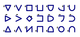
Musa text - letters, numbers, and punctuation - is composed of 10 basic shapes. Short letters use only one of these shapes, while tall letters use two of them. Most of them form families: the same shape in different orientations. When talking about Musa letters, we consider that each of these orientations is a different shape. Counted that way, Musa uses 26 shapes.
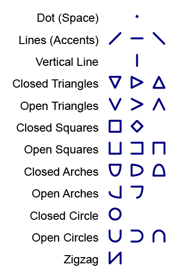
We call the shapes that mix straight and curved segments "arches", and open them by removing half of the curved part.
The shapes that lie sideways (red below) are called "lazy shapes", and is considered the lazy version of .
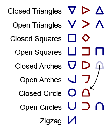
The shapes below look different when they're part of a tall letter - equilateral triangles become right triangles, the last three shapes flip over as bottoms, and the last two shapes lose some of their parts on connecting:
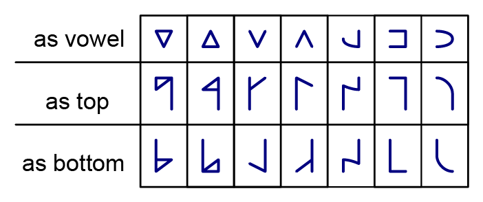
In tall letters, the two shapes are connected by a stem. Here's what the shapes look like as both tops and bottoms. You can see that the lazy (sideways) shapes turn around to face right when they're on the bottom of a tall letter.
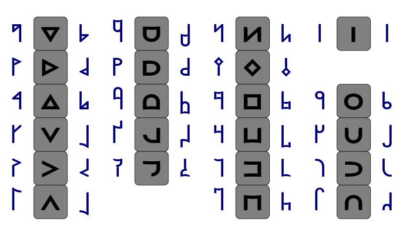
I'll summarize what each shape means on the Letter Names page, but you'll see the regularities yourself as you learn the letters.
Left or Right
Musa letters are never the mirror image of each other, since people would confuse them. Instead, tops that turn to the right - sharp or smooth - are bent down, while the shapes that turn left stay level, and the opposite is true of bottoms:

As you can see in the chart above, in most cases the stem is written to the right of the top and to the left of the bottom, following the usual left-to-right order of writing. But for some of the shapes, the stem is written on the left side of tops and the right side of bottoms - these shapes are called lefties. In several cases, a certain shape is a righty top but a lefty bottom, or vice versa. This helps to distinguish several shapes that might otherwise be mistaken for one another, especially when you're writing carelessly.
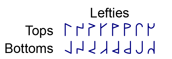
When both the top and bottom are righties, the stem is a "forward slash" diagonal, from upper right to lower left. When both the top and bottom are lefties, the stem will be a "backslash" diagonal, from upper left to lower right. But if one is a lefty and the other is a righty, the stem will be a vertical line on one side of the letter.

A diagonal stem cuts across some of the shapes - that's not a problem. Musa fonts sometimes truncate these interior stems. But the shapes with round interiors (facing the other shape) have curved stems that go around, not through.

There are two shapes - Pi and Pu - that are ambidextrous: they change from righty to lefty to line up with the bottom, so that the stem is always vertical (not diagonal):

There are another two shapes - Ma and Wa - that always connect in the center, no matter which other shape it's connecting to. Wa flips over when it's on the bottom:
Stroke Order
All the Musa letters can be written without lifting the pen, but you should start and end in the right places. The closed tops are always drawn starting with the lowest stroke, or the short vertical stroke if the stem is diagonal.
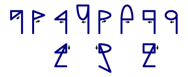
When they're bottoms, the stroke order is reversed.

And here's a chart showing the stroke order for the single shapes.
Up or Down
The shapes most easily confused are the triangles and wedges. The trick is to pay attention to which way it's pointing : some point up, some point down, and some point sideways.
Ascenders and Descenders
Text in the Roman alphabet, like this page, is a sequence of shapes in the bottom half of the line (the x-height ), with a few ascenders (b d f h i j k l t and capital letters), and even fewer descenders (g j p q y). In contrast, Musa text fills much more of the vertical space of each line, which makes Musa look a little like ALL-CAPS. In other words, Roman looks like a solid bar of text with lines stuck onto it, while Musa looks like a solid bar of text with spaces cut out of it.
Many Musa fonts raise four shapes - Wa, Tu, Su, and Ku - when they're on top (but not when they're high vowels), forming ascenders. Those fonts also lower Wa, Ti, Si, and Ki when they're a bottom (not low vowels), forming descenders. The two ambidextrous shapes you met above - Pi and Pu - also form ascenders and descenders, but by stretching instead of raising or lowering.

Here's an example, the English word from. The f is both an ascender and a descender, while the m is just a descender.

The end result is to give the word a distinctive outline (gray), even before you look at the shapes. Like a key fitting into a lock, that shape helps you recognize the word quickly.
Orientation
Many Musa letters are rotated versions of other letters, so in contexts where the orientation isn't obvious - for example, on Scrabble tiles or on loose pieces of paper - we use underlining to indicate which side is down. The underline should be a different line weight from the text, so that a single underline isn't confused with a low level accent, but if more than one letter is underlined, there's no ambiguity.
But no Musa letters are reflected versions of other Musa letters, so you can read Musa through a glass door.
Raised Text
In 1821, Louis Braille invented the system that still bears his name, in which raised dots are used to encode the letters of the alphabet. Using braille, blind people can read, and there are now electromechanical refreshable braille displays. However, nowadays many blind people use screen readers that read an audible version of the computer screen aloud.
We don't use dots to write Musa for blind people; we use raised text, in which normal Musa letters are printed with an ink thick enough to be felt with your fingers. This has two advantages. First, it can be learned by people who become blind later in life, and thus already know how to read printed letters - such people often have trouble learning braille. Second, a single display of raised text can be read by both blind and sighted people, while braille requires a repetition of the text.
The Hentrax Musa Element font is designed for raised text (among other uses).
Gaits
Consider the following romanized words:
| vyesna | vasant | spring | primavera | igba ojo | haru | chuntyan | ar-rabiy' |
|---|---|---|---|---|---|---|---|
| Russian | Hindi | English | Spanish | Yoruba | Japanese | Chinese | Arabic |
They all have the same meaning, translated into various languages. If I asked you to guess which language each one was in, you might not get them all ... but I bet you'd do pretty well, despite never having seen or heard most of the words. How is that possible?
All language is a series of sounds and their music - tones, stress, intonation, and pauses - in sequence, but the way in which these sounds are grouped into larger units differs quite a bit between languages. And it's even more true when we consider how words are inflected. For example, to mark a word as plural, Russian would change the final vowel (or add one), English might change an internal vowel (man → men), Spanish would add an s, and Chinese wouldn't change anything.
In English, the most important grouping is the word. Of course, we have syllables grouped around a nuclear vowel, but it's not always clear where they split: is it read.er and redd.er, or rea.der and red.der? We don't care. But in Chinese, the division into syllables is very important - ji.nyan is not the same as jin.yan - while the division into words is less important (and not written).
When we write all these different languages in Musa, we always write the sequence of sounds that comes out of your mouth as you say the words - we call that the one-dimensional or 1D form. But we arrange the letters on the page in a way that suits the pattern of the language, and we call that the two-dimensional or 2D form. Each of the different 2D patterns is called a gait, a name which is meant to evoke the different ways letters can walk together. The different gaits are described in full on the Gaits page - we'll postpone a deeper introduction until then.
Meanwhile, the Home page is a good place to see examples of the different gaits in action: the names of the languages. The names of the Arabic and Hebrew languages are written in the Abjad gait, the name of Hausa in Abugida gait, the names of Swahili, Yoruba, and Igbo in Syllabary gait, the names of Hindi, Bengali, Punjabi, and Tamil in Akshara gait, the names of Chinese, Cantonese, Vietnamese, and Thai in Fangzi gait, and the name of Japanese in Kana gait. All the others are in Alphabet or Ligature gait. Amazingly, all this variety has been implemented using only fonts - the underlying data is in the same format. So you can switch from one gait to another simply by changing fonts! That's why Musa font names include the gait.
In all gaits, the writing is from left to right, in rows running downwards. In all gaits, tall letters are taller than short letters, and taller than they're wide. Each gait has its own rules determining which letters are connected, adjacent or spaced, but the one-dimensional sequence of letters is the same in all gaits. All the other key dimensions: stroke weights, letter widths, space widths, line heights and so forth, are left to the typographer. If he does his job well, the result is easy to read and pleasing to the eye.
Letter Spacing
Spacing is left to the font designer, but there are some basic ideas that are common to all Musa fonts. Musa is written on a grid whose cell size corresponds to the size of a Musa vowel. Tall letters are twice as tall, and fill a domino (a 2x1 rectangle). It's the height of this domino that is the named size of the font; for example, a 12-point font will have cells 6 points x 6 points. A line of Musa text will come pretty close to the height of a line of text of the same font size in other scripts.
But the letters don't completely fill the cell or domino : there is spacing around them (like CSS margin). The space between letters depends on the font, with half of it in each domino. Adjacent letters are in adjacent cells. Musa is usually monospace, with fixed-width letters. The Break and the Long mark have whitespace on both sides.
In Alphabet gait, ascenders and descenders extend half a cell beyond other letters, into the space between lines of text. Roman descenders hang down below the baseline to a similar extent. However, most Roman fonts have ascenders that only go as high as capital letters, while that's the height of normal Musa letters - Musa ascenders go higher. The result is that Musa text needs more space between lines than Roman text. Here's a diagram - the black grid shows the borders between cells:

In Kana gait, the kana fill 2x2 cells.

In Fangzi gait, the fangzi fill 3x3 cells, with double margin all around, but centered on the same centerline as other gaits.

Cursive spacing depends on the font - vowels may be written inside the consonants or above them - but the line of consonants is always two cells tall.

The space between words is always one cell wide, and lines of text are 3 cells apart, center to center, for all gaits except in Fangzi gait, where they're 4 cells apart.
| < A Quick Look | Vowels > |
| © 2002-2025 The Musa Academy | musa@musa.bet | 25jun24 |


